

Choosing a neutral palette isn't about playing it safe; it's about curating a high-end sanctuary that breathes with effortless elegance. Many homeowners worry that a neutral colour palette home decor approach will leave their space feeling sterile or uninspired. You might feel stuck between choosing warm or cool undertones, fearing your living room will end up looking more like a clinical ward than a designer retreat. It's a common struggle to make a minimalist space feel truly cosy and lived-in.
We believe your home should be your most beautiful accessory. This guide will help you master the art of neutral styling so it feels incredibly lush and inviting. You'll discover how to transform your living space into a sophisticated sanctuary using the power of layered tones and rich textures. We'll show you how to mix beiges, creams, and greys with total confidence to create a cohesive aesthetic that's both modern and welcoming. From understanding natural light to selecting the perfect tactile finishes, we are covering everything you need to build a home that radiates grace and personal style.
Key Takeaways
- Learn why a neutral colour palette home decor strategy is about creating a sensory sanctuary rather than just filling a room with white and beige.
- Master the "golden rule" of neutral styling by layering rich textures like linen, wool, and stone to add depth without clutter.
- Discover how to distinguish between modern minimalist and organic boho-chic aesthetics to find the perfect fit for your personal style.
- Get a practical room-by-room framework for applying neutral tones that balance sophisticated elegance with a warm, welcoming feel.
- Understand how to curate hand-picked homewares that act as the final "jewellery" to complete your home's stylish transformation.
The Psychology of a Neutral Colour Palette in Home Decor
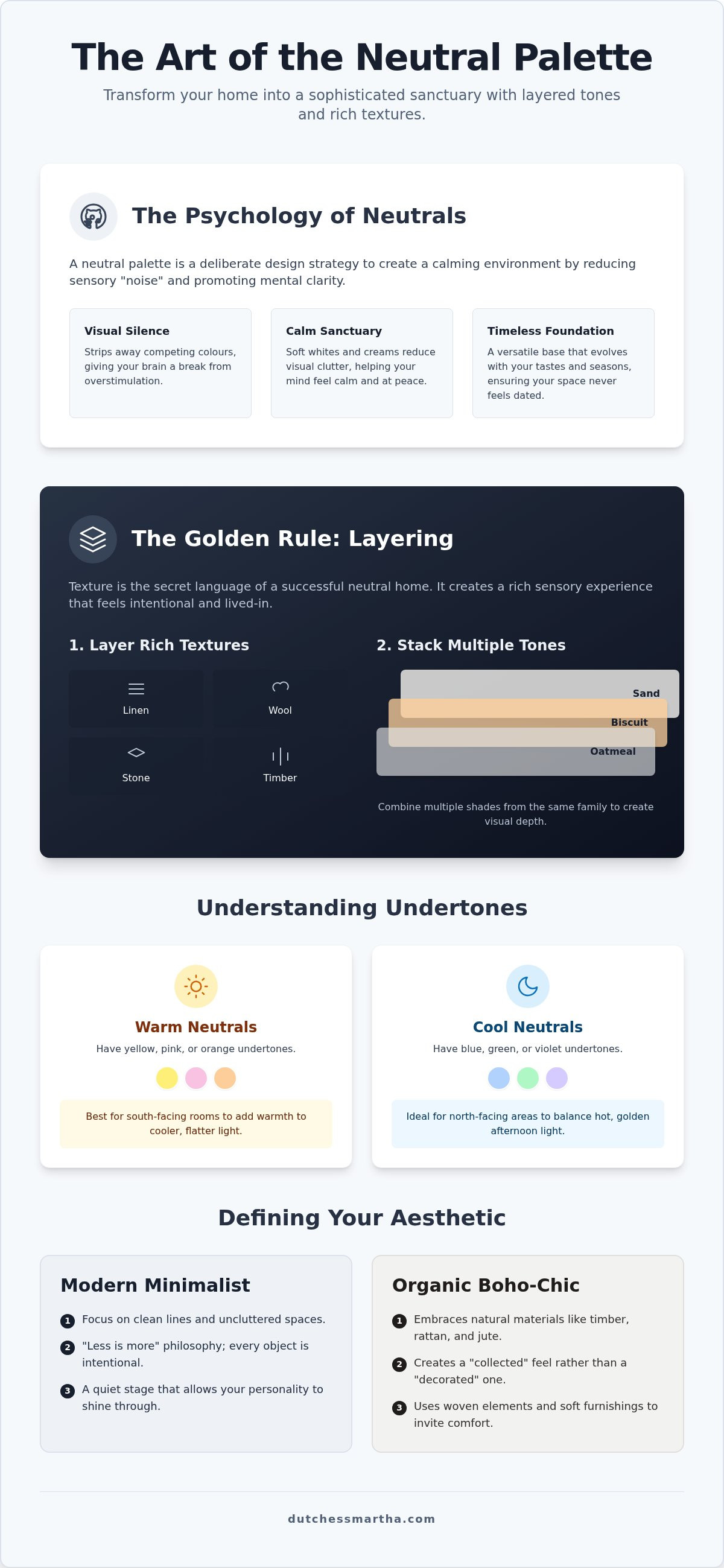
A neutral palette is far more than a safe choice. It's a deliberate design strategy for a sophisticated life. True neutral colour palette home decor involves a nuanced spectrum of mushroom, greige, sand, and charcoal. These shades offer "visual silence." This concept provides your brain with a much-needed break from the constant stimulation of our fast-paced world. By stripping away loud, competing colours, you create a space that feels intentional and grounded. It becomes a place where you can finally exhale.
Creating a Calming Sanctuary
Soft whites and delicate creams do more than just brighten a room. They actively reduce visual clutter. This reduction in sensory "noise" is directly linked to improved mental clarity. When your surroundings feel calm, your mind follows suit. Embracing a Minimalist aesthetic isn't about living in a void. It's about curating exactly what you need to feel at peace. Neutrals act as a quiet stage for your personal expression. They allow your personality to shine through without the decor shouting over you. Think of your home as the ultimate fashion accessory. Just as a classic silk scarf elevates an outfit, a neutral backdrop elevates your daily mood and self-assurance.
The Versatility of Neutrals
One of the greatest benefits of a neutral base is its incredible flexibility. Your home can evolve effortlessly with your tastes or the changing Australian seasons. During a bright Queensland summer, you might layer in crisp linens and cool-toned stone. As the brisk Victorian winter approaches, you can easily swap these for chunky wool knits and warm timber accents. This adaptability ensures your space never feels dated or stagnant.
Investing in a neutral colour palette home decor scheme also offers practical advantages. Neutral homes often carry a higher perceived value in the Australian market. They present a sophisticated "blank canvas" that allows others to envision their own style within the space. It's an investment in both your current well-being and your property's longevity. You aren't just choosing a paint colour. You're building a timeless foundation for a stylish, confident life that feels both modern and deeply welcoming.
The same principles of creating a professional and polished "blank canvas" apply to your digital presence as well. If you are looking to find out more about how expert design can elevate your online brand with the same level of sophistication as your home, exploring professional web solutions is a natural next step.
Mastering the Art of Layering Textures and Tones
Texture is the secret language of a successful neutral colour palette home decor. When you remove vibrant hues, the eye naturally seeks out tactile interest to find meaning in a space. Think of texture as your new "colour." By mixing smooth stones with rough-hewn timbers and soft linens, you create a sensory experience that feels rich and intentional. Without these layers, a beige room risks looking unfinished or flat. It's the difference between a house that feels staged and a home that feels lived-in and loved.
Avoid using just one shade of cream. Instead, stack multiple tones from the same family. Combine oatmeal, biscuit, and sand to create depth. Contrast is equally vital for a sophisticated result. A dark charcoal cushion on a light grey sofa provides a visual anchor, preventing the furniture from "disappearing" into the walls. This approach aligns with recent research on color preferences in homes, which highlights how layered neutrals promote a sense of relaxation and refined comfort. By varying the "weight" of your tones, you guide the eye through the room with ease.
Understanding Warm vs. Cool Undertones
Identifying the base of your neutral is crucial, especially under the intense Australian sun. Warm neutrals have yellow, pink, or orange undertones. They work beautifully in south-facing rooms that receive cooler, flatter light. Cool neutrals have blue, green, or violet bases. These are perfect for balancing the hot, golden afternoon glow in north-facing living areas. Don't be afraid to mix them. Pairing a cool grey wall with a warm timber floor creates a sophisticated balance that feels modern yet grounded. It adds a designer edge that keeps the palette from feeling one-dimensional.
Adding Depth with Natural Materials
Natural materials are the backbone of a boho-chic sanctuary. Timber accents provide immediate warmth, while woven elements like rattan and jute add a rustic, organic edge. Layering these materials creates a home that feels "collected" rather than just "decorated." Soft furnishings are your final layer of magic. Drape a chunky wool throw over a linen armchair to invite touch and comfort. If you're looking for that perfect finishing touch, explore our curated homewares collection to find pieces that act as the jewellery for your room. These hand-picked accents provide the final layer of personality and grace your space deserves.
Defining Your Aesthetic: From Minimalist to Boho-Chic
Finding your place within a neutral colour palette home decor scheme is about more than picking a paint swatch. It's about how you want to feel when you walk through the door. Do you crave the structured clarity of a high-end gallery, or the soulful, layered warmth of a coastal retreat? Identifying your personal style is the first step toward building a home that radiates confidence. Your aesthetic serves as a filter. It helps you decide which textures and pieces deserve a place in your sanctuary.
Modern Minimalism is defined by precision. It utilizes sharp lines and polished surfaces to create a sense of order and calm. In contrast, Organic Boho celebrates the "perfectly imperfect." This style is the ultimate expression of effortless elegance. It blends designer-inspired luxury with the kind of relaxed comfort that invites you to kick off your shoes. While minimalism seeks to remove, boho-chic seeks to curate. It’s about finding a beautiful balance between high-end fashion and a lived-in, welcoming atmosphere.
The Modern Boho Neutral Look
This style thrives on organic shapes and hand-crafted details. It is where your neutral base meets genuine personality. You might incorporate iconic elements like dreamcatchers to add a whimsical, ethereal touch to a bedroom or quiet nook. These pieces serve as focal points that draw the eye without breaking the calm of your palette. Imperfect textures, such as a hand-thrown ceramic vase or a fringed linen cushion, add a layer of character that mass-produced items simply cannot match. It is about telling a unique story through your surroundings.
Scandi-Inspired Simplicity
If you prefer clean lines, the Scandi-inspired look offers a beautiful alternative. It marries functional beauty with "hygge," the Scandinavian concept of cosy contentment. In an Australian home, this often translates to light-toned woods like Tasmanian Oak or Blackbutt paired with soft, creamy whites. To keep a minimalist space from feeling cold, focus on warm functionality. Use a sheepskin rug over a sleek wooden bench or a cluster of candles on a stone tray. The goal is a space that feels curated and tidy but never clinical. By choosing the right aesthetic, your neutral colour palette home decor becomes a true reflection of your lifestyle and self-assurance.
A Room-by-Room Guide to Neutral Styling
The Living Room: A High-Traffic Haven
Start your transformation with the largest piece of furniture. A sofa in a durable oatmeal or dove grey fabric acts as a sophisticated anchor for the entire space. From there, it is all about the layers. Add plush wool cushions and a fringed throw to create instant "luxe" appeal. This prevents the room from feeling sterile. Coffee tables and shelves are the perfect places to showcase your curated style. Use the "rule of three" when styling. Group a stone tray, a scented candle, and a small timber bowl together for a balanced look. Just as you would choose the right accessories to complete a fashion-forward outfit, hand-picked homewares act as the final polish for your living area. Look for pieces with organic shapes to soften the lines of the room and add a touch of modern femininity.
The Bedroom: Soft Layers for Rest
Your bedroom should feel like a cloud. Opt for breathable, natural fabrics like linen in various tonal whites. This material is ideal for the Australian climate because it keeps you cool in summer and cosy in winter. Layering different weights of fabric adds depth without needing bold patterns. Try a quilted coverlet over smooth, high-thread-count sheets. You can also introduce tactile joy with a chunky knit throw at the foot of the bed. Use soft, indirect lighting to bring out the warmth in your neutral walls. Bedside styling should remain simple to encourage mental clarity. A single ceramic lamp and a stack of your favourite books are often all you need. This creates a serene environment that prioritises rest and personal wellbeing. It is your personal retreat from the world.
Ready to elevate your sanctuary? Explore our latest homewares arrivals to find the perfect neutral accents to complete your room-by-room transformation.
Curating Your Space with Dutchess Martha Accents
Mastering a neutral colour palette home decor strategy is a journey that ends with mindful curation. Once you have established your foundation of tones and textures, it's time to add the finishing touches. At Dutchess Martha, our philosophy is simple. We believe in a life that is hand-picked and beautifully styled. We view homewares as the "jewellery" for your room. Just as a gold necklace completes a simple linen dress, a well-placed vase or a textured tray completes a living space. These accents provide the final layer of personality that transforms a house into a home.
Editing is your most powerful tool in a neutral environment. It's tempting to keep adding, but true sophistication often lies in what you choose to leave out. Take a moment to step back and assess your space. If a corner feels heavy, remove one item to let the remaining pieces breathe. This creates the "visual silence" we discussed earlier. It ensures that every object you've selected has the room to shine and tell its own story. Trust your taste and let your intuition guide your final styling decisions.
Hand-Picked Homewares that Tell a Story
Choosing items that spark joy and confidence is the secret to a successful sanctuary. Small accents make a massive impact when your backdrop is understated. A single hand-crafted ceramic bowl or a uniquely woven basket can become a conversation starter. These pieces add a layer of soul that mass-market distribution often lacks. Our curated collection is designed to help you find those special items that resonate with your personal narrative. We focus on quality and longevity so your home feels timeless rather than trendy. When you surround yourself with things you love, you create an atmosphere that nurtures your spirit every day.
Effortless Elegance: From Wardrobe to Home
Your living space should be a seamless extension of your personal style. If you already embrace the relaxed, chic aesthetic of boho clothing, your home decor should mirror that same sense of freedom and grace. Think of your interior as a "home wardrobe" filled with timeless staples and seasonal accessories. This consistency builds self-assurance. It allows you to feel completely at ease in an environment that reflects who you are. You deserve a home that makes you feel attractive and inspired. Start your style journey today with Dutchess Martha and discover the joy of living in a space that is as fashion-forward as you are.
Elevate Your Home Sanctuary Today
Transforming your living space into a sophisticated retreat is a journey of intentional selection. You've learned that mastering a neutral colour palette home decor is less about the absence of colour and more about the presence of texture. By layering rich linens, natural timbers, and soft wools, you create a home that feels both modern and deeply welcoming. Remember to balance your undertones against the unique Australian light to ensure every room radiates warmth and effortless elegance.
At Dutchess Martha, we bring boutique styling expertise from Bentleigh East directly to your door. Our hand-picked collection features weekly new arrivals; this ensures your home always feels fresh and inspired. We invite you to explore our curated collection of homewares at Dutchess Martha and discover designer-inspired elegance tailored for the modern woman. Your style journey is an expression of joy and self-assurance. Embrace the art of neutrals and watch your home transform into the stylish sanctuary you deserve.
Frequently Asked Questions
Is a neutral colour palette boring for home decor?
A neutral palette is only boring if it lacks variety in texture and tone. Success with neutral colour palette home decor comes from layering different materials like linen, stone, and timber. These elements create visual interest through subtle shadows and tactile appeal. Instead of a flat look, you achieve a sophisticated sanctuary that feels curated and high-end. It's about letting the quality of your materials speak for themselves without needing loud colours.
What are the best neutral colours for a small living room?
Soft whites and light creams are the most effective choices for smaller Australian living areas. These shades reflect natural light, making the walls appear to recede and opening up the floor plan. Avoid heavy, dark beiges that can make a room feel enclosed. Opt for a cool-toned white if your room faces the hot afternoon sun to keep the space feeling airy, fresh, and surprisingly spacious.
How do I add "warmth" to a grey neutral room?
You can add immediate warmth to a grey room by introducing natural timber accents and metallic finishes like brass or gold. Soft furnishings also play a vital role in this balance. Swap out cool-toned cushions for oatmeal or biscuit shades in heavy, tactile knits. These warmer layers break up a cool grey base; they create an inviting atmosphere that feels like a designer-inspired retreat rather than a cold gallery.
Can I mix different wood tones in a neutral home?
Mixing wood tones is encouraged because it adds a sense of history and depth to your home. The secret is to keep the undertones consistent across your pieces. For example, pair a light oak table with walnut shelving if both have a warm, golden base. This creates a collected look that feels intentional. Avoid clashing a very red-toned timber with a grey-washed wood, as this can disrupt the visual flow.
What is the most popular neutral colour for 2026?
Industry forecasters suggest that earthy mushroom and warm terracotta-infused beiges will dominate the 2026 design landscape. These shades move away from the stark greys of the past toward more organic, grounded tones. They offer a sophisticated bridge between traditional neutrals and natural clay colours. This shift reflects a global desire for homes that feel like protective, earth-connected cocoons. It's a trend that prioritises comfort and a deep connection to nature.
How do I use a neutral palette if I have kids or pets?
You don't have to sacrifice style for family life. Choose performance fabrics for your main furniture pieces, such as slipcovered sofas in heavy-duty linen that you can easily wash. Use patterned neutral rugs, like a distressed jute or a mottled grey wool, to hide small marks or pet hair. Choosing high-quality, durable materials ensures your neutral colour palette home decor remains practical and beautiful despite the daily chaos of a busy household.
What textures work best for a neutral boho-chic look?
Woven materials like rattan, seagrass, and jute are essential for achieving a boho-chic aesthetic. You should also look for imperfect fabrics such as fringed linen cushions or chunky macramé wall hangings. These tactile elements add a soulful, hand-crafted dimension to your space. They soften the clean lines of modern furniture and bring a sense of effortless elegance that defines a classic, fashion-forward lifestyle.
Should my neutral walls be the same colour as my trim?
Painting your walls and trim in the same neutral shade is a popular technique to create a seamless, modern look. This colour drenching method makes a room feel larger and more cohesive because it removes visual breaks. If you prefer a more traditional feel, choose a trim colour that is one or two shades lighter than your walls. This provides a subtle contrast that highlights your home's architectural details without being distracting.